The Last Edits
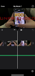
I finished up editing! We added the title sequence as the last part of our video.
The first step of doing this was deciding on a font. On imovie, there are a couple different ones to choose from. Unfortunately there aren't any spooky fonts, but the one we chose was still good. I wanted a font that faded in and out. In each clip, we moved the title around to different parts of the screen for some diversity. I messed around with the sizing until I found one that everyone liked. I also made the titles all white. One of my group members thought black would be better, but I thought white would stand out more.
Editing was a quick and easy process for the most part. The only trouble I had was sometimes the text wouldn't fade in or out. But it was easy to fix. When adding the title of the movie, I knew I wanted to make it a different color and font. This would help it stand out. The color we chose was red. At first, the red we picked was too dark and it was kind of hard to see. So I made it a little brighter, and it looked great. The font we picked was a little thinner than the other titles, and I made it take up the whole length of the screen.
Once we finished editing, I wanted to watch through it. Everything matched up well and our video looked great. I made sure to save all of our editing changes so they wouldn't be lost.


Comments
Post a Comment